
Music Festival App Design
Overview
Designing a music festival application presented an exciting yet complex challenge. The goal was to create a user-friendly app for an alternative/dream pop music festival that aligns with the audience's creative and free-spirited nature while addressing essential user needs such as navigation, scheduling, and ticketing.
The process began with sketches, moved to Miro wireframes, and culminated in a low-fidelity and high-fidelity. prototype. Key app features included a landing page, lineup page, artist details, stage timetables, and a comprehensive ticketing section.
Tools Used: Miro, Figma
Focus Areas: Wireframing, Prototyping, Mood Board Creation, User Testing

Sketches
The process began with hand-drawn sketches. I outlined essential features, including a landing page, lineup overview, artist profiles, stage timetables, and a detailed ticketing page. These sketches helped establish the basic layout and navigation flow, prioritizing simplicity to make the app accessible for first-time users.
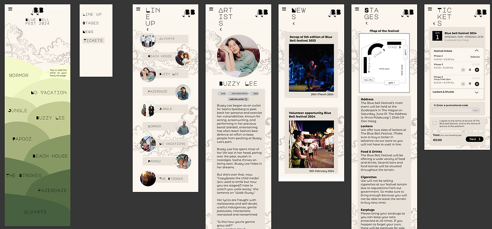
Miro Wireframes


Using Miro, I transformed my sketches into wireframes to create a low-fidelity prototype. This prototype featured a simple layout with:
-
A traditional menu structure for intuitive navigation.
-
A lineup page where band names appeared on creatively styled "hills," offering a playful and engaging visual element.
-
A tickets page with detailed information about lockers, pricing, and ticket types to give users a sense of control before making a purchase.
The simplicity of the design aimed to help new users adapt quickly while leaving room for creative enhancements in the high-fidelity stage.

Mood board
To define the app’s aesthetic and mood, I created a mood board inspired by alternative/dream pop festivals. This genre appeals to open-minded, free-spirited audiences who value creativity, individuality, and eco-friendliness. The mood board served as a foundation for the high-fidelity prototype, ensuring the app design conveyed a sense of anticipation and connection that mirrored the festival experience.
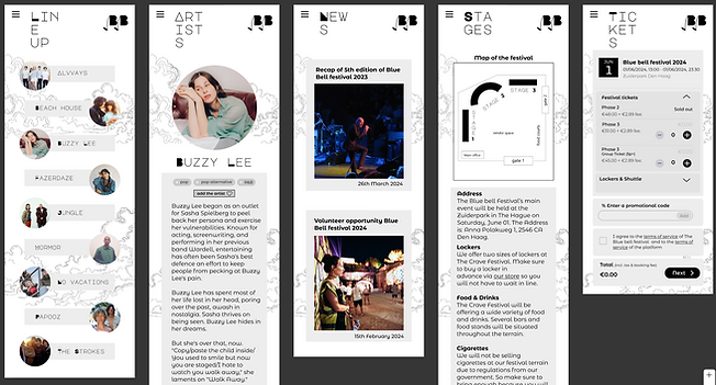
High-Fidelty Prototype
I created the high-fidelity prototype, focusing on visual appeal and functionality. Key enhancements included:
-
Color Palette: Replaced pure black-and-white contrasts with earthy tones inspired by the mood board to reflect the festival’s relaxed and creative vibe.
-
Landing Page: Added gradients, clouds, and logos integrated into a "sky" for a vibrant, welcoming feel.
-
Lineup Page: Retained the "hills" concept for displaying band names, adding gradients to enhance the visual impact.
-
Tickets Page: Increased font sizes for readability and made the page more prominent in the menu by using a contrasting button.
-
Navigation: Repositioned the home icon to the upper-right corner for clarity and ease of access, serving as an escape route.
-
Personalization: Introduced a feature to “like” artists directly from the landing page and artist profiles, increasing user engagement.

Testing & Iterations
I conducted testing by using herustic evaluation sheet and in person testing with protocols and observational learing. It provided valuable feedback that shaped further iterations:
-
Interactive Elements: Users requested more movement and engaging visuals on the landing page.
-
Navigation Clarity: Repositioned and refined navigation elements, such as the timetable display instructions and the home icon.
-
Symmetry and Fonts: Improved symmetry across screens and adjusted font sizes, especially on the tickets page.
-
Color Palette: Aligned the design more closely with the mood board, avoiding stark contrasts in favor of earthy tones.Personalization Features: Enhanced the artist “liking” feature to make it more intuitive.
Reflection
This project taught me the importance of balancing creative design with usability, particularly for an audience that values individuality and artistic flair. While the testing process was insightful, I realized that finalizing the color palette earlier could have streamlined the design process. Overall, this assignment reinforced how thoughtful design can enhance the user’s anticipation and enjoyment of an event, building a meaningful connection between the app and the festival experience.